Mobile Friendly version website
Your website will be perfect on your mobile as the online editor also includes a special dedicated feature for mobile version, allowing to create true and unique mobile version experience for your visitors.
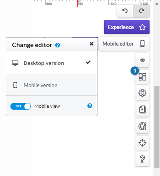
Once a page is designed, go to the management panel on the right side of the online editor and click on "Mobile editor" button to choose the desktop version or mobile site.
First, activate this option by using the slider "Mobile view" and when done, navigate between the two options Desktop version and Mobile version to continue building your page.
When selecting Mobile version, the grids are automatically adapted to the standard size of the smartphone.
Be careful: as it is treated as the same page, whatever (text, image...) you add in either version will be on the other version, except for the way it looks or appears.
Similarly, if you have already created your page in Desktop version and then while in Mobile version, you delete something, it will also be deleted in the Desktop version. The awesome part of the Mobile version, is that it brings a most unique experience to the visitor.
Note however, that there are some applications that, in the mobile version, have specific features.
Menu:
The menu application can be modified specifically for the mobile version of the website by clicking on the menu modification bar and on the wheel icon. At the bottom will be available the mobile feature that will turn the menu into a button. You can set a background for opening the menu when the button is clicked.
Text:
Font size of the text can be changed, by clicking on the text application edit bar and on the A + and A- icons to increase and decrease the size of the entire text.